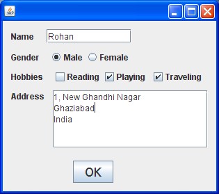
Working with the basic Swing Controls in Java GUI programming i.e using the simple data members(properties) and methods.
Used to display a short text.
Cannot insert a line break within the text in a label.
Can be used to display images.
Generally used describe text-fields
The table below reveals the methods that can be used to set the basic properties for a label
| Method | Description | Example |
|---|---|---|
| setText | To set a single line text that the label will display. | jLabel1.setText(“A String”); |
| setIcon | To display a image in a label. | jLabel1.setIcon(new ImageIcon(“D:\books.jpeg”)); |
| setEnabled | The enabled state of component.True if enabled else false (Boolean) | jLabel1.setEnabled(true); |
| setBackground | To set a background colour for label. | jLabel1.setBackground(new java.awt.Color (255, 255, 51 )); |
A simple ‘push’ button used to perform some action or function.
All the properties of button are almost similar to the above mentioned properties for a label. Other useful properties are:-
| Method | Description | Example |
|---|---|---|
| setMnemonic | Lets you specify the shortcut key or the access key, that you can combine with Alt to invoke the button | jButton1.setMnemonic(‘K’); |
| setToolTipText | Sets the text(tool tip) to be displayed when you rollover mouse over button | jTextField1.setToolTipText(“Click!”); |
Used as a input field from which we can obtain text
Only single line input allowed
Can be used to display text
The methods above for the label component can also be used for a text-field except the setIcon method.
The other useful methods for a textfield are described below
| Method | Description | Example |
|---|---|---|
| getText | To retrieve a single line text as a String. | String a=jTextField1.getText(); |
| setEditable | Sets whether the user can edit the text in the textfield. | jTextField1.setEditable(false); |
| setToolTipText | Sets the text(tool tip) to be displayed on mouse over | jTextField1.setToolTipText(“Enter Name”); |
Used as a input field for multi-line text. eg- address
Can be used to display multi-line text eg- displaying some codes
You can set desired number of rows.
Apart from the basic methods that you have read for the text-field, the useful methods for a Text Area are:-
| Method | Description | Example |
|---|---|---|
| .append | Adds the specified text to the end of the already existing text | jTextArea1.append(“End of text”); |
| setLineWrap | Sets whether lines are wrapped if they are too long to fit within the allocated width | jTextArea1.setLineWrap(true); |
| setWrapStyleWord | Sets whether lines can be wrapped at white space or at any character | jTextArea1.setWrapStyleWord(true); |
Used to get an option out of several mutually exclusive options eg- Gender(Male or Female)
 They must be added to a button group so that a user cannot select more than one , otherwise they will act as check boxes
If, in a buttonGroup if a user selects a option then the other is automatically deselected.
| Method | Description | Example |
|---|---|---|
| setText | Sets the display text for the Radio Button | jRadioButton1.setText(“Male); |
| setEnabled | To enable the component. True to enable else false (Boolean) | jTextArea1.setLineWrap(true); |
| isSelected | Returns the state of component.True if selected else false | if (jRadioButton1.isSelected()) gender=”Male”; |
| setSelected | To change the state of component. True to select else deselect | jRadioButton1.setSelected(false); |
Note: To clear(deselect) all radio buttons in a button group, use buttonGroup1.clearSelection();
Used to get one or more options out of several options which are not mutually exclusive eg- Hobbies(a user may select more than 1)
It is not necessary to put them in a button group, but it is recommended so that you can perform group actions like deselecting all.
Almost all the properties for Radio button are applicable here.
Below you can see a image depicting the basic use of the above mentioned simple swing controls.
 |
| Simple Java Swing Controls |
Related Video Tutorial:

can you make a tutorial for Combobox?